Customizable Digital Card Platform for Fast and Easy Networking.

Building a customizable digital business card platform that simplifies professional networking—enabling instant sharing, personalized design, and seamless contact exchange without the friction of traditional methods.
Designed for professionals and creators, this platform offers deep customization, instant sharing via QR and links, and a seamless experience for creating and managing digital identities.
View Live Site
Project duration
4 months (Ongoing)
ROLE
Product Designer (Co-designer)
TOOLS
Figma
Skills
User Research, Task Flows, Prototyping, Usability Testing, Competitive Analysis, QA
Objective
The goal of this project was to create a digital business card creator that stood out from existing competitors by delivering a modern, intuitive, and fast user experience. We focused on addressing key pain points in the market—offering a sleek UI, streamlined customization options, and a frictionless sharing process. Beyond matching industry standards, our solution enhances the networking experience with features like rich design flexibility and a share history log, making it easier for users to revisit and reconnect with contacts over time.
My Contributions.
I collaborated closely with another designer to bring this project to life—transforming low-fidelity wireframes into fully prototyped, high-fidelity screens. I was responsible for translating the complete desktop experience into responsive, high-fidelity mobile designs, ensuring consistency and usability across platforms. In addition, I refined and expanded the design system to support evolving features and maintain visual cohesion. Throughout development, I regularly conducted QA reviews to catch design regressions and uphold quality across builds.
PROBLEM AND SOLUTION
Many digital business card platforms fall short on customization, mobile usability, and ease of access—often requiring sign-ups before use. CardLinq fills these gaps with a mobile-first approach, flexible design options, and a seamless, account-free setup, enabling users to quickly create, personalize, and share their cards.
Conducting the Research.
We began by analyzing a wide range of competitor platforms—not only identifying pain points and gaps in their user flows, but also noting features and experiences that worked well. This helped us shape a clear direction for what CardLinq could improve and where it could differentiate. In parallel, we crafted detailed personas and user journeys centered around key user types, such as business owners creating standardized cards for employees, freelancers looking for a polished personal brand, and networkers prioritizing quick, on-the-go sharing.
Competitor Study.
Our primary competitor, Blinq, provided a clear benchmark for evaluating the current landscape of digital business cards. While the platform offered core functionality, we identified several areas for improvement. The interface felt visually unpolished, with awkward hover states, inconsistent button sizing, and lengthy, uninspired scrolling interactions. More critically, Blinq lacked the deep customization options that many users—especially brand-conscious professionals and teams—would expect. These observations helped validate our design direction for CardLinq: a polished, flexible, and highly customizable alternative.
Personas.
To guide our design decisions, we identified three primary user groups based on our research and competitive analysis. First, company owners seeking to create branded, standardized digital cards for their employees—prioritizing consistency, ease of deployment, and a professional look. Second, employees using those cards to represent their company, needing something simple, mobile-friendly, and reliable for day-to-day networking. Lastly, individual users such as freelancers, contractors, and creatives who value personalization and flexibility to craft a unique digital identity that reflects their brand.
Identifying the Problems
With a clear understanding of CardLinq’s users, I began identifying the key problems we needed to solve. Using research insights, I defined the main issues and applied them to my initial design concepts.
Limited Customization
Many platforms limit users to restrictive templates, offering little room for brand expression or creative flexibility—especially frustrating for freelancers and creatives.
team scalability
Most digital card platforms aren’t built with larger organizations in mind, making it difficult for business owners to standardize and manage cards across multiple employees.
poor usability
Cluttered interfaces, inconsistent elements, and confusing user flows slow down the creation process and create friction during sharing—ultimately hurting adoption and usability.
Sitemap.
Once we finalized the core feature set, we created a sitemap to map out CardLinq’s structure and user flows. This helped us visualize how users would navigate through key areas like card customization options, sharing methods, and profile management. It also gave us a clear framework to guide our wireframes—ensuring a smooth creation and sharing experience. Additionally, it allowed us to define the conversion flow for onboarding new users, helping us minimize friction and make the transition from visitor to engaged user as seamless as possible.
Lo-Fi Wireframes.
After finalizing the sitemap, we began creating low-fidelity wireframes for the landing page and card customization flow—focusing on the first-touch experiences for new users. These early designs helped us quickly test layout ideas, prioritize features, and define the overall structure of the site. By starting with the two most critical entry points, we were able to shape a foundation that balanced visual clarity with ease of use.
LOFI TO HIFI
With the low-fidelity wireframes in place, we transitioned into high-fidelity designs while also exploring CardLinq’s branding direction. This parallel process helped us shape the visual identity early on and ensure the UI felt cohesive, modern, and user-friendly.
Branding.
Our initial direction leaned toward a colorful, playful aesthetic—using a wide range of vibrant colors to reflect the app’s flexibility and creative potential. This approach aimed to visually reinforce the customization-first nature of CardLinq. However, after discussions with the client, we pivoted toward a more modern and professional look, prioritizing clean white space with subtle color accents. This shift allowed the branding to better align with the expectations of business users while still maintaining a fresh, approachable feel.
Design and Technical Approach
While adding new features and quality-of-life improvements, we stayed focused on CardLinq’s core mission: letting users create and share digital cards quickly and seamlessly. Every design choice—from customization to onboarding and sharing—was guided by this goal, ensuring a smooth, intuitive experience with added value and minimal friction.
One-Page, Non scrolling creation page.
Create and customize your entire digital card on a single, clean interface—no endless scrolling or tab-switching, just a focused, efficient workflow.
Built-In Analytics.
Each card includes insights like views, contact saves, and link clicks—giving users a clear picture of how their card is performing.
Fast-One Click Sharing.
Quickly share your card with one tap—whether you're in a meeting, at an event, or on the move. No delays, no fumbling.
Scalable for Businesses.
Standardize your team’s cards with branded templates and centralized controls—so every employee represents your company with a unified, professional look.
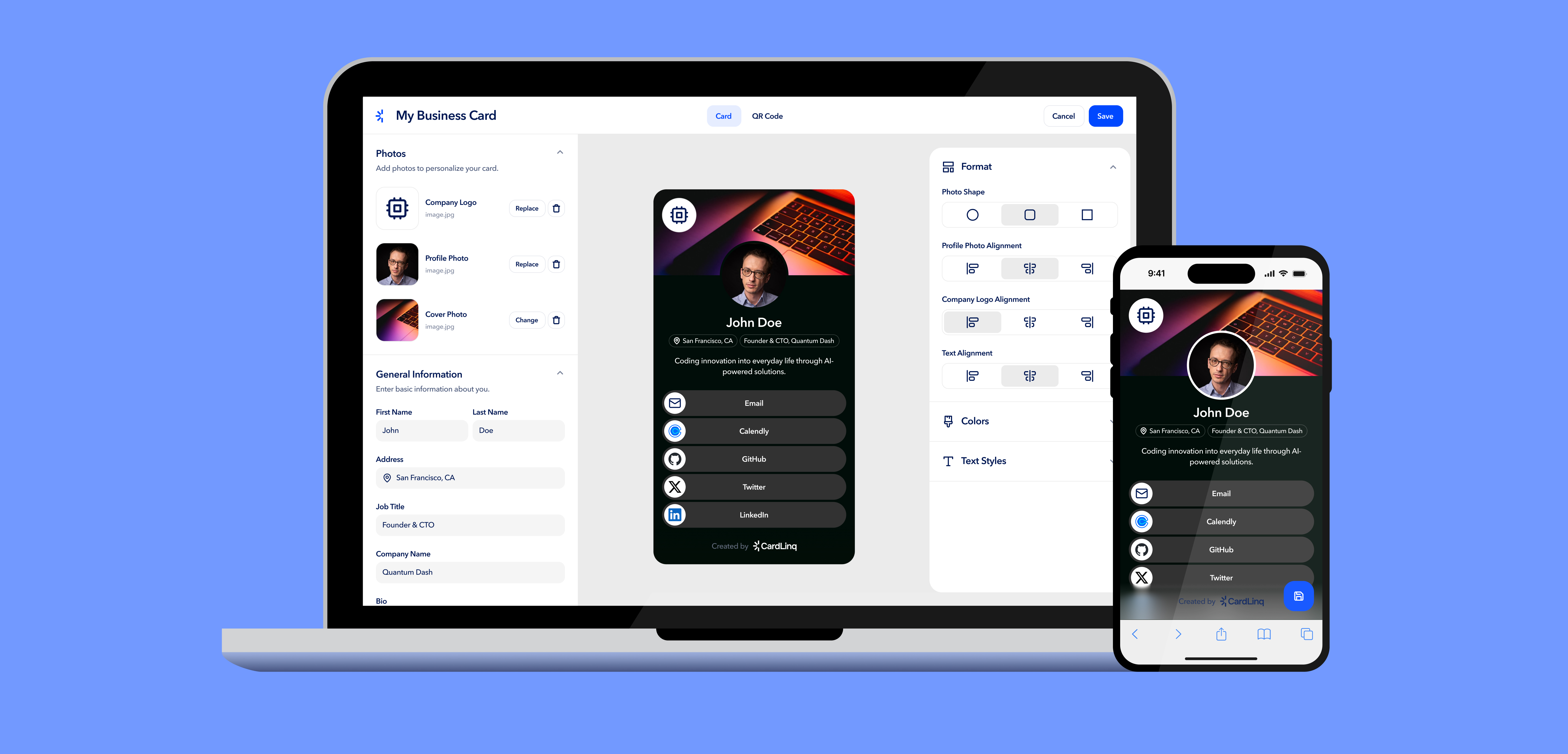
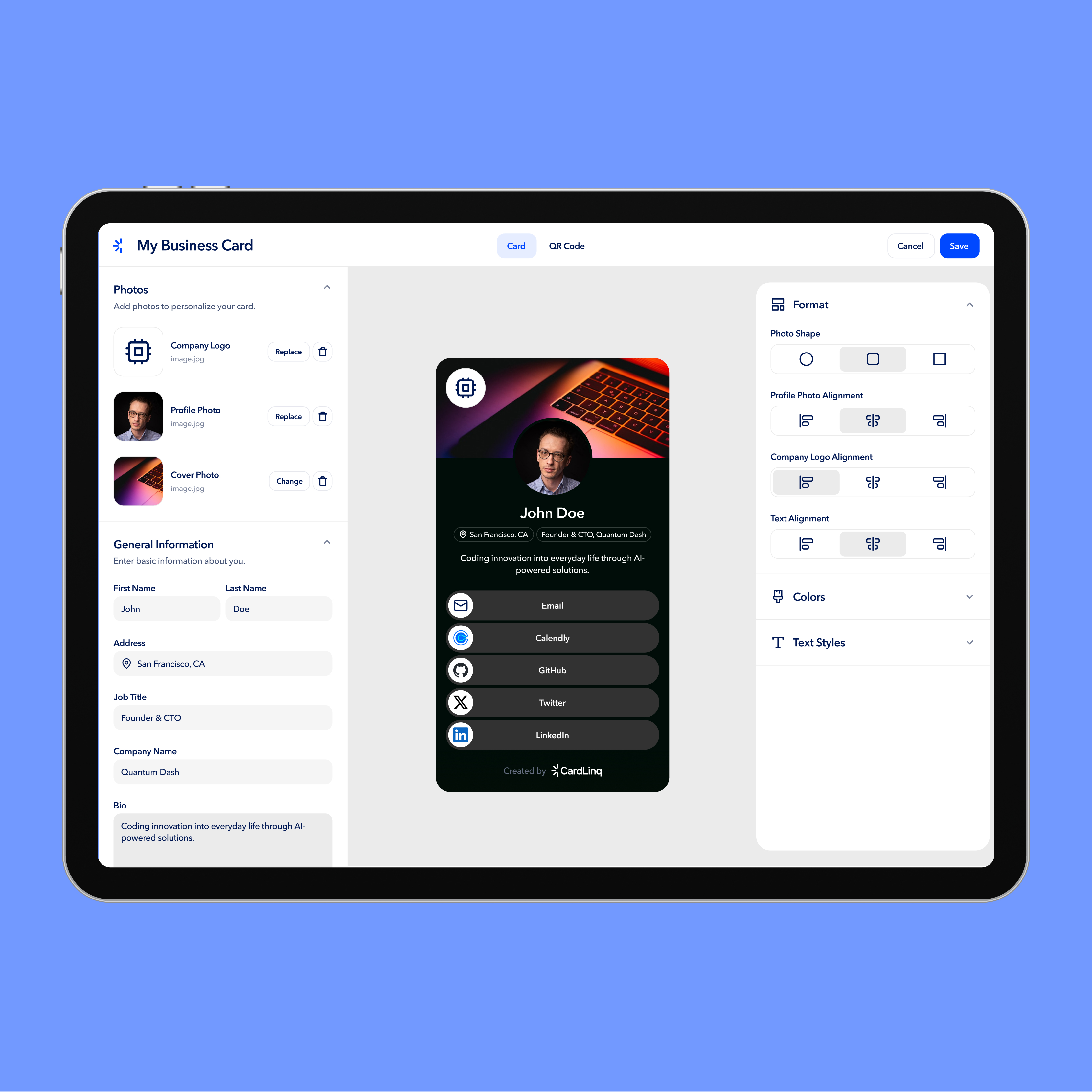
Challenges and Solutions.
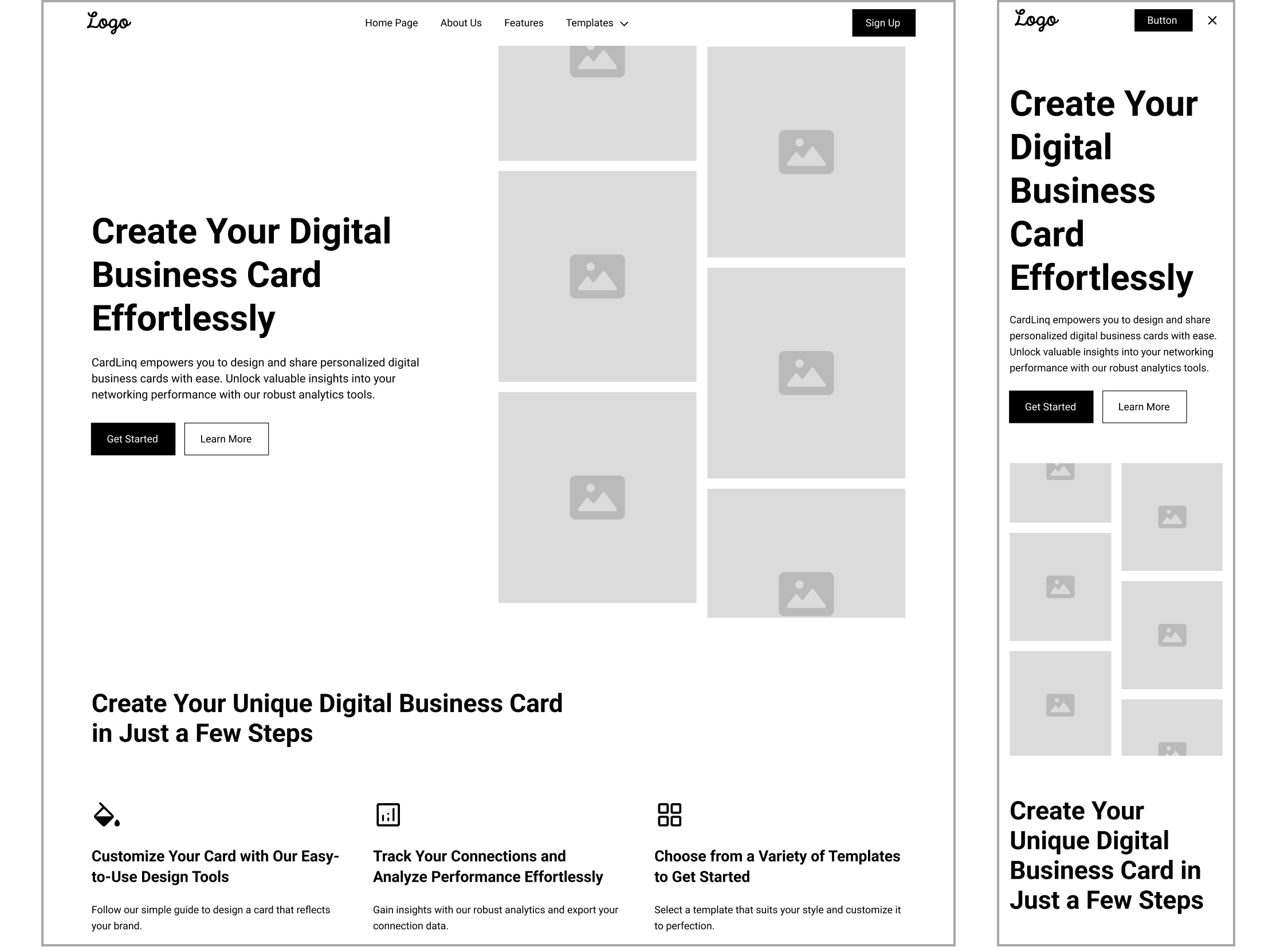
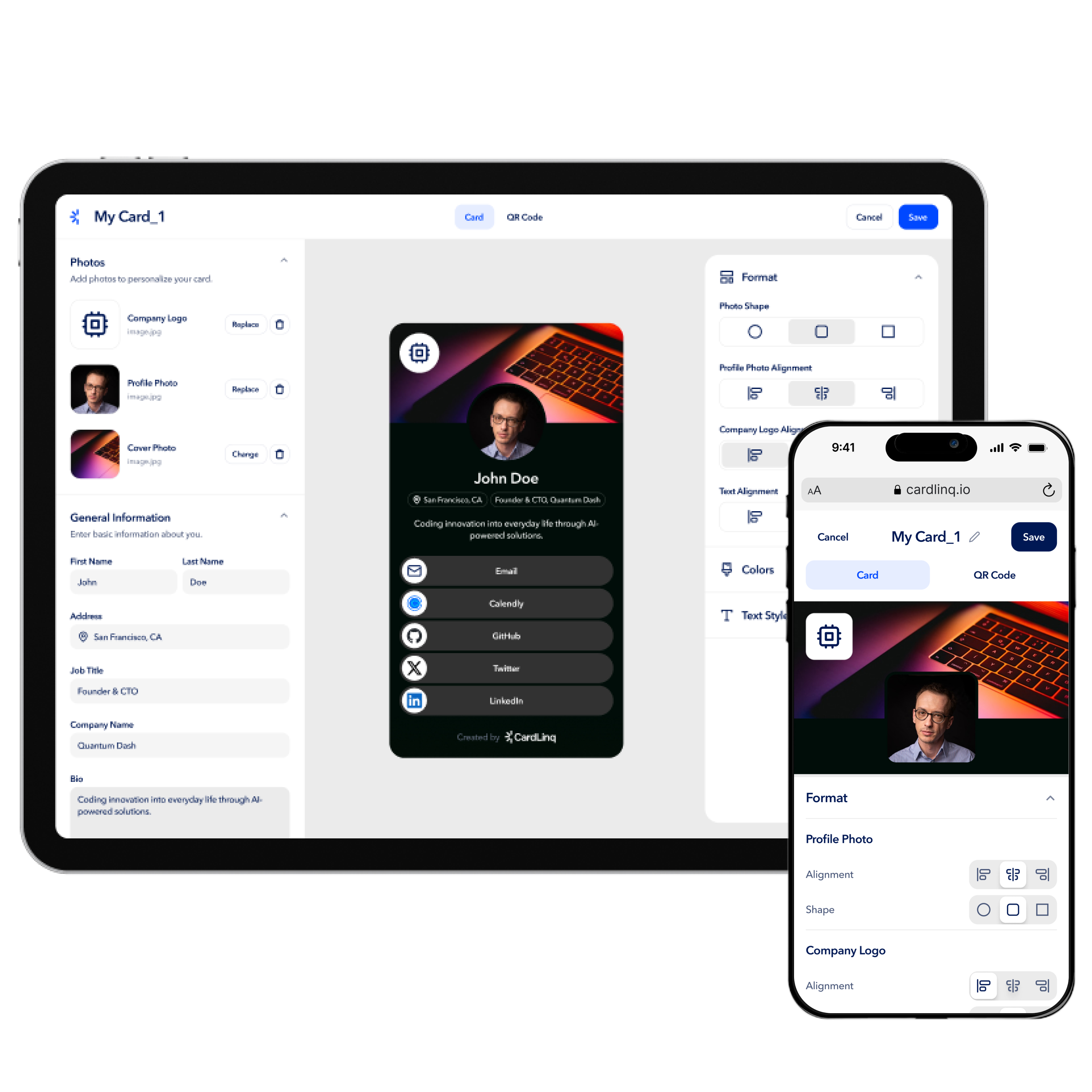
Throughout the design process, my co-designer and I explored several ambitious ideas to help CardLinq stand out—one being a social layer that allowed users to “friend” others on the platform. While promising, we ultimately chose to put this feature on hold to focus on the core goal of the MVP: fast, seamless card creation and sharing.

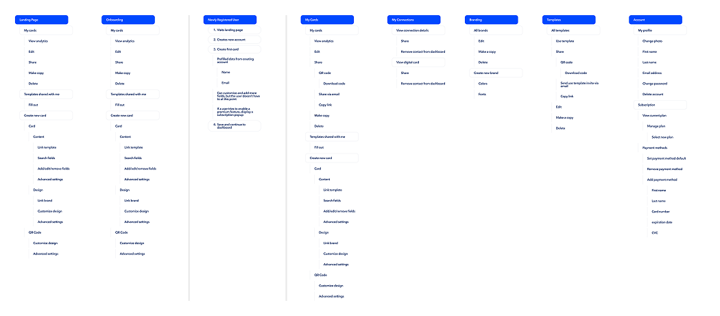
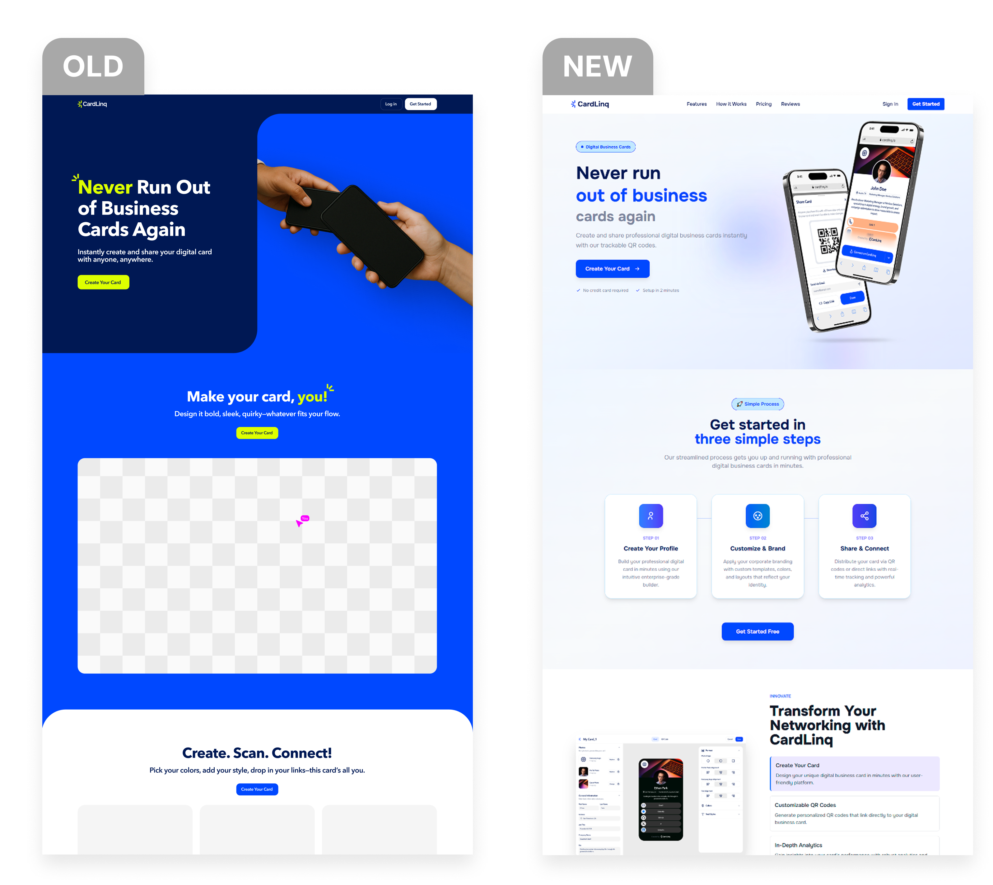
The challenge was maintaining focus. As we began integrating these extra ideas into the user flow, it became clear they introduced unnecessary complexity that risked slowing down the experience. To stay aligned with our mission, we made the decision to streamline the product and prioritize what mattered most.

To support this direction, we relied on a frequent check-ins with stakeholders, rapid prototyping, and weekly QAs. These helped us keep the experience focused, efficient, and aligned with user needs.
Outcomes.
This project moved quickly, with tight timelines and fast iteration cycles. The MVP was well-received, though a few edge cases emerged that required immediate design adjustments. Despite the pace, the final designs were clear, polished, and developer-friendly—allowing the team to implement the core screens within a week.
Current Status & Next Steps.
CardLinq is still in active development, with the core feature set being implemented by the development team. I’m currently conducting weekly QA sessions, identifying edge cases, and refining designs as new feedback surfaces. In parallel, I’m continuing to push new features and polish existing ones to ensure the final product delivers a smooth, consistent experience. As we approach launch, my focus remains on usability, responsiveness, and maintaining alignment with CardLinq’s core mission: fast, intuitive digital card creation and sharing.

Let’s Work Together.

Ready to bring your vision to life? Let's team up on your next project and create something unforgettable together.
Let's Connect
The CardLinq Case Study Highlighted the Power of Focused Design and Clear Product Vision.
This project reinforced that great design isn't about adding more—it's about refining what's essential. While we explored a wide range of features, the most impactful decisions came from narrowing our focus and building around speed, usability, and simplicity. That clarity helped us deliver a polished experience that users could engage with immediately.
Seeing the product take shape so quickly—and watching ideas translate into a clean, intuitive interface—was incredibly rewarding. It reminded me that thoughtful, user-centered design backed by clear priorities can move fast and deliver real value. I’m proud of what we built and excited to see how CardLinq continues to grow.
RESULTS
CardLinq: A Collaborative Approach to UX Design and Staying Aligned with What Matters
View Live Site
What I Learned.
Designing CardLinq under fast-moving timelines taught me how to prioritize effectively and maintain clarity under pressure. One of the most valuable aspects of this project was working alongside a co-designer. Collaborating in real time allowed us to bounce ideas off each other, quickly iterate on concepts, and catch pain points or usability flaws that one of us might have missed alone. This back-and-forth made the design process more focused, efficient, and ultimately stronger.

It also reinforced the importance of clear communication, shared ownership, and knowing when to scale back in order to stay aligned with the product’s core mission. Balancing speed with thoughtful execution was key—and this project sharpened my ability to do both.
Other Projects.