Tutor Discovery Platform Designed to Connect Students with the Right Educators.

A one-stop tutoring platform that connects students with the right tutors, makes scheduling effortless, and keeps learning progress organized—all in one intuitive place.
This intuitive platform streamlines the process of finding qualified tutors through personalized filters, profile highlights, and clear scheduling options.
View Prototype
Project duration
2 months
ROLE
Lead UI/UX Designer
TOOLS
AdobeXD, Figma, Photoshop
Skills
User Research, Task Flows, Prototyping, Usability Testing, Interaction Design
Objective
Unison was created to address common challenges students face when seeking help or reaching out to teachers. Finding the right person or the appropriate way to ask for assistance can often be difficult. This platform provides clarity for both users and tutors—users can clearly communicate their needs, and tutors understand their responsibilities from the outset.
PROBLEM AND SOLUTION
Finding the right tutor can be overwhelming, especially when learning styles and subject needs vary from person to person. Unison simplifies the search by allowing users to filter by subject, availability, and teaching style—making it easy to connect with the perfect tutor and book sessions in just a few clicks.
Conducting the Research.
To guide my research for Unison, I set clear goals and developed a focused plan to better understand the tutoring landscape. This included exploring best practices for tutor searches, identifying the target audience, analyzing competitors, and examining the tutor's role in education. I also aimed to uncover user experiences with existing services and gain insight into the goals, needs, motivations, and frustrations of potential Unison users.
User Research.
To ensure a well-rounded understanding of tutoring needs, I gathered insights from a diverse group of 20 survey participants ranging in age from 13 to 55. The research focused on their methods for finding tutors, personal preferences, and the time involved in the process. The results revealed a clear gap in the market: users lacked a reliable, dedicated platform that could efficiently match them with tutors based on their specific needs.
Market Research.
The next step was conducting thorough market research to gain a solid understanding of the environment Unison operates in. This included analyzing market dynamics, consumer behavior, and relevant business trends. The insights gathered helped identify opportunities, anticipate challenges, and guide the strategic direction of Unison.
Competitor Study.
While platforms like Wyzant, Chegg, and Brainly each excelled in certain areas, they also lacked key features that could enhance the overall user experience. By evaluating their strengths and weaknesses, I identified opportunities for Unison to fill in the gaps and offer a more comprehensive, user-friendly tutoring solution.
Personas.
After analyzing interview data, I created two user personas to represent individuals with different backgrounds and goals, helping to simulate how various users might navigate the app. Kevin, a high school teacher, is motivated to help his students reach their full potential by connecting them with tutors who match their learning styles. Cidney, a busy mother and sales manager, wants to ensure her child receives proper academic support despite her limited availability. These personas were designed to highlight potential user pain points and frustrations, guiding more empathetic and effective design decisions.
Identifying the Problems
With a clearer understanding of Unison’s users, I began identifying the core problems they face, using research insights to define key issues and inform early design ideas.
Limited Availability
Highly qualified tutors often juggle full-time jobs or studies, making it difficult to find ones with schedules that align with students’ needs.
learning styles
Students learn best when teaching methods match their style, but many struggle to find tutors who can adapt accordingly.
location constraints
In-person tutoring is often limited by location, and while online options help, they’re not always suitable for every learner.
Sitemap.
After reviewing the survey data, I developed a clear vision for the site’s structure. The goal was to create a platform that worked seamlessly on both web browsers and mobile devices, ensuring a smooth and intuitive user experience across all screens. To guide this process, I created a sitemap to outline the key pages and features to include in the design.
Wireframes.
Using the sitemap as a guide, I began sketching paper wireframes to outline the basic layout of the homepage. Key elements I focused on including were a hero image, a featured content section, and a footer with company details. To keep track of the strongest concepts, I marked my favorite designs with a star.
Lo-Fi Wireframes.
Using the paper wireframes as a foundation, I transitioned into Adobe XD to create low-fidelity wireframes for both mobile and desktop. I mapped out key screens including the homepage, search page, tutor profile, and the complete filtered search experience.
Usability Testing.
Before moving to visual design, I conducted usability testing to ensure the app’s structure and flow were intuitive for first-time users. Feedback from five participants was categorized into functions, tone, visuals, and user flow, helping identify patterns and highlight areas for improvement in the final design.
PRIORITY REVISIONS
Using insights from the usability tests, I began refining the design by addressing key user feedback. Revisions focused on improving navigation, clarity, and visual hierarchy to create a more intuitive and user-friendly experience that better aligned with user needs.
Revamping the Homepage
I originally aimed for a unique homepage to help Unison stand out. But user feedback showed that familiar layouts often work better. Many top tutoring platforms follow proven structures for a reason. I refined the hero image and aligned the layout with trusted industry norms to improve usability and brand consistency.
Updating the Tutor Page Layout
User testing revealed that the tutor profiles felt cluttered and lacked clear structure. Key information wasn’t easy to find, making the experience frustrating. I redesigned the layout to highlight primary details and moved secondary info into a scrollable side panel for better readability and flow.
Enhancing Tutor Browsing
Users noted the absence of key features—especially a search bar. Filters helped, but weren’t enough for targeted searches. I added a search function and moved filters to a fixed left sidebar that scrolls with the page, making it easier and faster to browse tutors.
Revamping the Homepage.
I originally aimed for a unique homepage to help Unison stand out. But user feedback showed that familiar layouts often work better. Many top tutoring platforms follow proven structures for a reason. I refined the hero image and aligned the layout with trusted industry norms to improve usability and brand consistency.
Updating the Tutor Page Layout.
User testing revealed that the tutor profiles felt cluttered and lacked clear structure. Key information wasn’t easy to find, making the experience frustrating. I redesigned the layout to highlight primary details and moved secondary info into a scrollable side panel for better readability and flow.
Enhancing Tutor Browsing.
Users noted the absence of key features—especially a search bar. Filters helped, but weren’t enough for targeted searches. I added a search function and moved filters to a fixed left sidebar that scrolls with the page, making it easier and faster to browse tutors.
HIFI DESIGNS
Using updated wireframes, usability feedback, and a new brand guide, I developed high-fidelity wireframes and a final prototype, integrating Unison’s visual identity into the app’s design.

Let’s Work Together.

Ready to bring your vision to life? Let's team up on your next project and create something unforgettable together.
Let's Connect
Unison: Designing a Smarter Way to Connect Students with the Right Tutors.
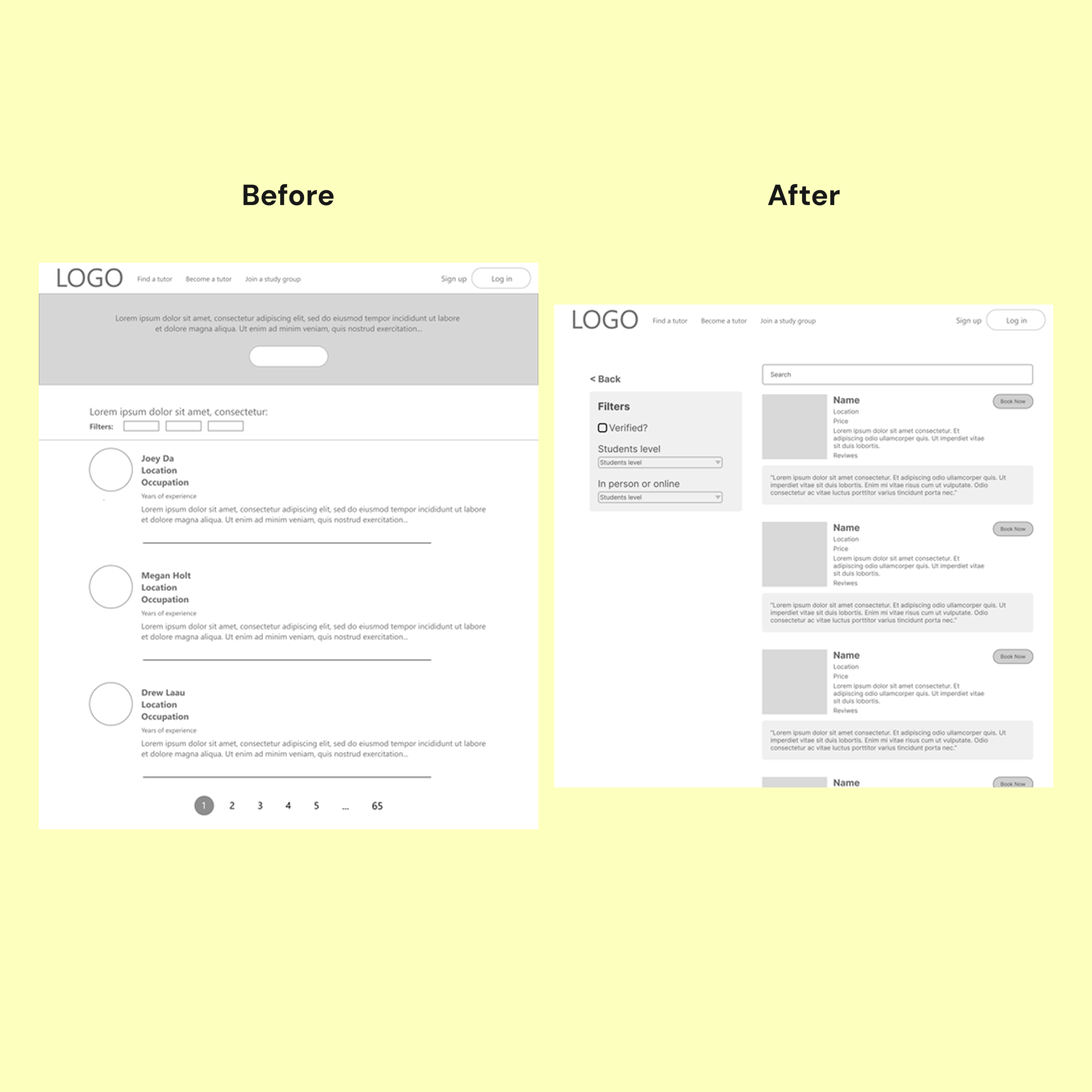
Creating this website was a major learning experience, especially since it was my first time designing a full website rather than an app. It challenged me to think more broadly about layout, responsiveness, and the user experience across different devices. Throughout the process, I gained a deeper understanding of how to structure content, guide users through a journey, and maintain visual consistency across a more
complex digital product. There were many features and ideas I would have loved to explore further, but time and scope required me to prioritize the essentials. I hope to continue refining this project and eventually bring it to life, so that anyone—regardless of background—can access a reliable, dedicated tutor through a platform that truly meets their needs.
RESULTS
The Unison case study taught me the importance of adaptability, creative problem-solving, and designing with real users in mind—lessons I’ll carry forward in every future project.
View Prototype
What I Learned.
This project taught me to be more intentional with both research and design decisions. I learned that not everything needs to be tested—prioritizing research goals helps manage time effectively and keeps the process focused. I also realized the importance of questioning my choices early on, as rushed decisions often led to avoidable revisions. By taking more time to plan and reflect, I can make more confident design choices and reduce unnecessary rework. Moving forward, I’ll apply these lessons to create more efficient, thoughtful, and user-centered solutions.
Other Projects.