Website Redesign Driving Engagement for a Employer-Backed Physical Therapy Platform.

SimpleTherapy is a digital health platform that helps individuals manage and recover from musculoskeletal pain through personalized exercise therapy. By combining guided video sessions with clinical expertise, SimpleTherapy empowers users to take control of their recovery—improving mobility, reducing pain, and preventing future injuries.
Responsive redesign of SimpleTherapy’s website to improve usability, modernize its presence, and increase conversion rates—while maintaining a friendly, trusted brand
View Live Site
Project duration
2 months
(June 2023 - August 2023)
ROLE
Lead UI/UX Designer
TOOLS
Figma
Skills
Competitive Research, Sitemaps, Information Architecture, Wireframing, and UI Design
Objective
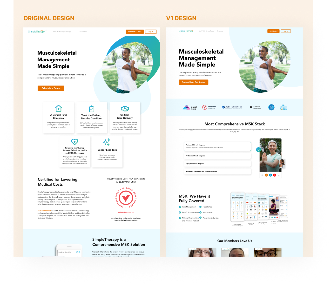
The SimpleTherapy website redesign aimed to strengthen their digital presence and better reflect their mission of helping people manage and recover from pain through personalized exercise therapy. The previous site felt outdated, with a dense layout, inconsistent visuals, and limited hierarchy that made navigation difficult. The redesign focused on creating a modern, approachable experience that communicates trust, accessibility, and movement—bringing their clinically backed, user-centered approach to life online.
TOTAL VISITS
+18%
The redesign attracted more traffic, resulting in an 18% increase in total visits, reflecting improved visibility and user engagement.
page load speed
+48%
An infrastructure update led to a 48% boost in page load speed, reducing wait times and creating a smoother browsing experience.
RESPONSIVE DESIGN
-37%
Mobile engagement saw a strong increase, with a 37% drop in bounce rate.
visit duration
+68%
Visitors are staying longer, shown by a 68% increase in average session duration, due to improved content and navigation.
WEBSITE GOALS
The website redesign for SimpleTherapy focused on improving conversion rates, creating a more seamless user experience, and boosting search performance.
Research.
Since this was a redesign, we began by evaluating the current site to identify existing issues. We analyzed user flows to understand where visitors were spending the most time. Despite the site having more than a dozen pages, we found that nearly 90% of users stopped at the homepage. The second most visited page — the Outcomes page — accounted for only about 5% of traffic, a significant drop-off. These insights helped us narrow our focus from redesigning the entire site to starting with the homepage, where we could make the biggest impact.
Research.
Digging deeper into the conversion data, we found that while 9.3% of users clicked the call-to-action button, fewer than 2% actually completed the form. This suggested that although many users showed initial interest, that interest dropped off once they encountered the rest of the flow.
What potental buyers think.
With that in mind, we wanted to understand what was causing users to feel uncertain about the product. We interviewed 10 product managers who had previously made purchasing decisions for healthcare services. During the sessions, we asked them to explore the current SimpleTherapy website and walk us through how they would evaluate whether SimpleTherapy was the right fit for their teams. This is what they said...
Fast iteration.
To test whether small improvements could boost conversion rates, we began the redesign by making incremental adjustments to the existing homepage. We modernized the UI, reduced repetitive text, and highlighted social proof to build trust. While this was a great starting point, the changes produced results too minor to draw meaningful conclusions—so we moved on to a new approach.
Bulk Updates.
Next, we experimented with larger iterations — if small tweaks weren’t moving the needle, perhaps more significant updates would. We completely overhauled the hero section, introducing a bold, high-impact image and removing most of the surrounding content. The goal was to test whether a strong, impressionable visual would better capture attention and drive engagement.
And it worked.
With the new designs, we saw a 14% lift in lead generation on the website, confirming that this direction was working. A deeper look at the data showed a nearly 25% increase in click-through rates on our primary CTA. Overall, traffic grew, conversion rates improved, and most importantly, Good+ Leads — users who were a strong fit for our product — also increased in sign-ups.
Putting it all together.
For the third version, we combined our learnings into a cohesive design. We introduced large, prominent metrics below the hero section to immediately highlight the product’s impact. We reintroduced supporting information about key benefits and target audiences, presented through an interactive scrolling experience to keep users engaged. We also added more social proof — including testimonials that reinforced trust and credibility — and ended with a clear walkthrough of the outreach process for users who might still be unsure about next steps.
HIFI DESIGNS
With the homepage redesign performing so well, we had a clear direction for the rest of the site. We carried over the new branding from the homepage and began designing the remaining pages for a consistent and cohesive experience.
RESULTS
Development and QA went smoothly across both design and functionality. After the website launched and showed positive results, we shifted focus to begin the redesign of the web app.
View Live Site
Other Projects.