Website Redesign Driving Engagement for a Medicare Support and Caregiver Platform.

DUOS is a healthcare technology company that connects Medicare beneficiaries and their caregivers with personalized resources—such as transportation, nutrition, and financial assistance—to support independent living and improve health outcomes.
Responsive redesign of DUOS’s website to improve usability, modernize its presence, and enhance access to health resources—while maintaining a friendly, trusted brand
View Live Site
Project duration
2 months
(June 2023 - August 2023)
ROLE
UI/UX Designer
TOOLS
Figma, Photoshop
Skills
Competitive Research, Sitemaps, Information Architecture, Wireframing, and UI Design
Objective
The DUOS website redesign aimed to strengthen their digital presence and better reflect their mission of connecting Medicare beneficiaries and caregivers to the resources they need for better health. Their website felt outdated, with clunky UI, cluttered layouts, oversized color blocks, and inconsistent typography. They aimed to rebrand with a lighter, more playful look and feel.
TOTAL VISITS
+18%
The redesign attracted more traffic, resulting in an 18% increase in total visits, reflecting improved visibility and user engagement.
page load speed
+48%
Design enhancements led to a 48% boost in page load speed, reducing wait times and creating a smoother browsing experience.
RESPONSIVE DESIGN
-37%
Mobile engagement saw a strong increase, with a 37% drop in bounce rate.
visit duration
+68%
Visitors are staying longer, shown by a 68% increase in average session duration, due to improved content and navigation.
WEBSITE GOALS
The website redesign for DUOS focused on improving overall website performance, ensuring a superior user experience and better search engine rankings.
Sitemap.
Before starting on wireframes, we first needed to identify the required pages and overall site flow. To do this, we reviewed the existing website and used it as a reference to build a preliminary sitemap. After collaborating with the client, we finalized the list of essential pages for the redesign.
UI Samples.
Before fully committing to the project, we needed to ensure our design direction aligned with the client’s vision for the rebrand. To explore this, we developed three distinct UI samples—all centered around the desired airy, playful theme, but varied enough to demonstrate the breadth of our design capabilities. To guide our creative process, we also asked the client to share reference websites they admired. Each concept included a logo, color palette, and three sample screens, helping the client visualize different stylistic possibilities before moving forward.
Lo-Fi Wireframes.
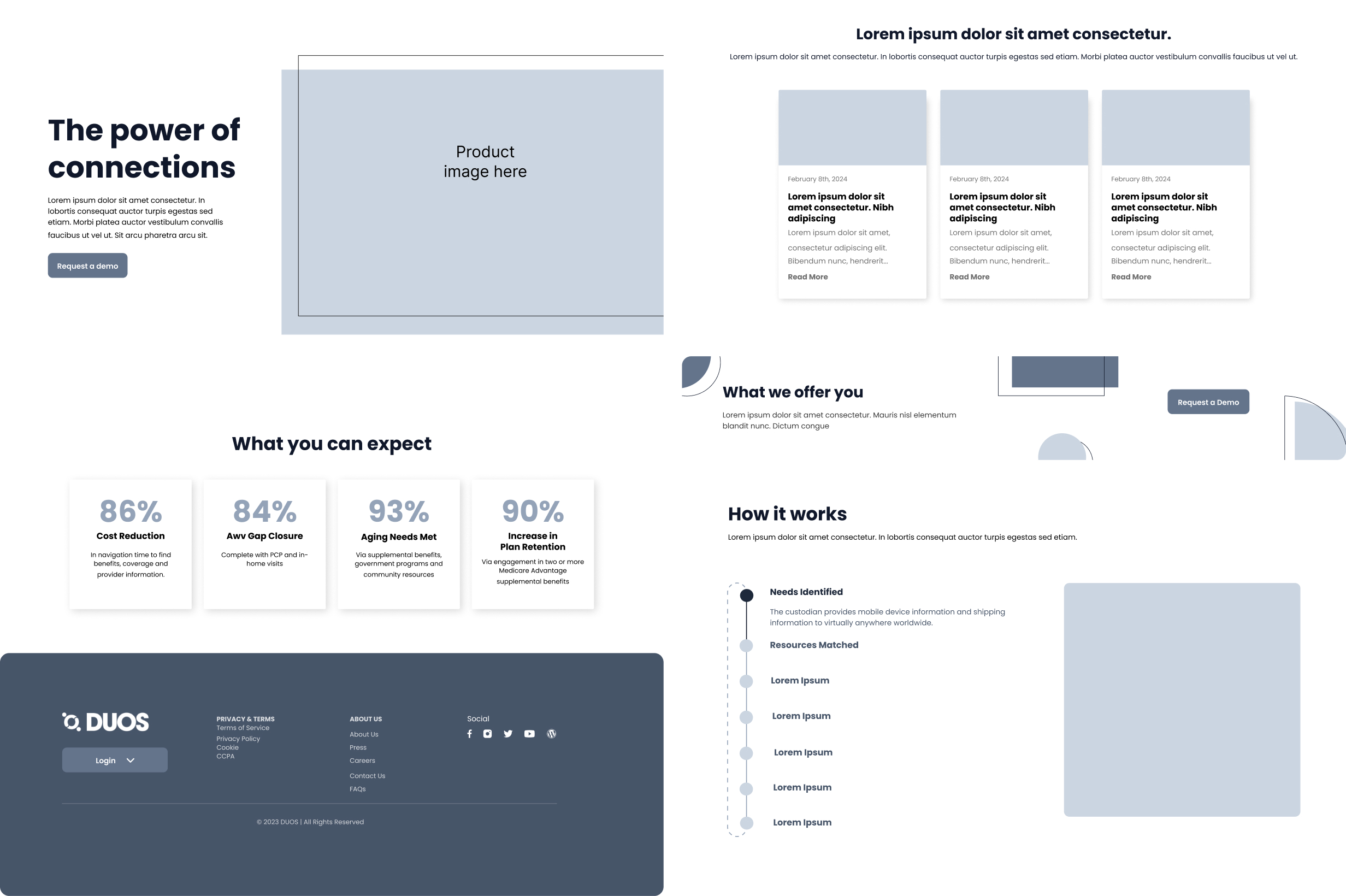
Using the sitemap as a guide, and the UI samples as a base, I began sketching paper wireframes to outline the foundational layout of the homepage. Key elements I focused on included a hero image, a featured content section, and a footer with company information.
Branding.
After the low-fidelity sketches were approved, we prioritized creating a clear brand and style guide to ensure consistency moving forward. Having this reference in place streamlined our design process, reducing time spent on decision-making and helping maintain a cohesive visual identity across all screens.
HIFI DESIGNS
With the style guide in place, we moved on to creating high-fidelity screens that would shape our final designs. Throughout the process, we ensured that each layout was responsive and adapted seamlessly to mobile devices.
RESULTS
Development and QA went smoothly in terms of design and functionality. When the website launched, our client was thrilled with the overall response and couldn't be happier with the improved design.
View Live Site
Other Projects.